

2025 Challenge Reveal

Candy with her selection of yarns ready weave a Nordic Country design (ready by Christmas)

Carla wove shadow weave/log cabin on her rigid heddle loom

Paula wove corduroy for the first time

Jamie wove 'country' towels and bonus coasters

Jane with her body of work heading towards a Peruvian inspired woven piece

Twanda with three tapestry projects from her magazine

Phyllis with a twill table runner using colors and directions from magazine project
Scenic
Valley Handweaver’s 2025 Challenge
You have selected a “Handwoven” magazine (Vintage 1987-1991[1] [2] ). The task will be to select a project from
this magazine and use the instructions provided to reproduce a woven sample
under the guidelines below:
1. You do not have
to complete the whole project, just a sample, i.e. if the project is to produce
a cut out and sewn garment you do not have to go through all the steps. A representative sample of appropriate size
is sufficient.
2. You do not have
to use the same yarn as described in the project. You may substitute your own thick/thin yarn
for their thick thin yarn trying to keep it proportional to the original. If three colors are used in the original you
may substitute your own yarn colors but there must be three.
3. Bring your finished challenge item and the original
magazine to the September meeting and be prepared to describe your process.
Other than the challenge of a perhaps ‘new’ technique this
will also to introduce older formats of instructions, in use at the time which
were not always as complete as they are in the same magazines today.
There will be a program in April which will identify some
techniques to ‘convert’ formats along with a general question and answer if you
have particular problems with your chosen project (somebody should be able to
help).
And don’t forget to explore the rest of the magazine as
there is a wealth of information in them
[1]
These magazines belong to Phyllis so once the challenge is complete; please
repeat.
[2]
Check out the rest of your magazine you may even see an early R&M Yarn
advert.
June 15, 2024 Challenge Reveal Below


The "Baa Ram Ewe" Challenge 2024This challenge is simple..."create a fiber sheep”

2025 Challenge Reveal
 | |
| Candy with her selection of yarns ready weave a Nordic Country design | (ready by Christmas) |
 |
| Carla wove shadow weave/log cabin on her rigid heddle loom |
 |
| Paula wove corduroy for the first time |
 |
| Jamie wove 'country' towels and bonus coasters |
 |
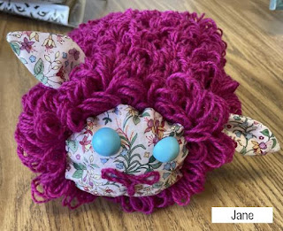
| Jane with her body of work heading towards a Peruvian inspired woven piece |
 |
| Twanda with three tapestry projects from her magazine |
 | |
| Phyllis with a twill table runner using colors and directions from magazine project |
Scenic Valley Handweaver’s 2025 Challenge
You have selected a “Handwoven” magazine (Vintage 1987-1991[1] [2] ). The task will be to select a project from this magazine and use the instructions provided to reproduce a woven sample under the guidelines below:
1. You do not have to complete the whole project, just a sample, i.e. if the project is to produce a cut out and sewn garment you do not have to go through all the steps. A representative sample of appropriate size is sufficient.
2. You do not have to use the same yarn as described in the project. You may substitute your own thick/thin yarn for their thick thin yarn trying to keep it proportional to the original. If three colors are used in the original you may substitute your own yarn colors but there must be three.
3. Bring your finished challenge item and the original magazine to the September meeting and be prepared to describe your process.
Other than the challenge of a perhaps ‘new’ technique this will also to introduce older formats of instructions, in use at the time which were not always as complete as they are in the same magazines today.
There will be a program in April which will identify some techniques to ‘convert’ formats along with a general question and answer if you have particular problems with your chosen project (somebody should be able to help).
And don’t forget to explore the rest of the magazine as there is a wealth of information in them
[1] These magazines belong to Phyllis so once the challenge is complete; please repeat.
[2] Check out the rest of your magazine you may even see an early R&M Yarn advert.


It can be any size, 2D or 3D.Any type of fiber, but predominantly fiber.It can be woven, felted, inkle loom, tapestry etc.If it ends up looking wonky you can call it abstract.
Have Fun! Nancy Marucco
===============================
2023 GUILD CHALLENGE REVEAL
June 17, 2023
(see below for Challenge guidelines)
 |
| Carla: Hot Pad & Glass Case--connected Inkle Loom strips |
 |
| Steve: Tapestry-style weaving on a loom--3 techniques |
 |
| Phyllis: Cotton Towels on 4H Floor Loom--Ms&Ws |
| Paula: Swimming Fish on Card Weaving Loom |
2023 Guild Challenge--"Paint it Black"
Carla Boudrot, Challenge Chair
In our guild challenge this year we are going to explore creative and dramatic use of color. For our project we can weave anything we want displaying three analogous colors paired with black. The black can be used to highlight your colors or the colors can be used to wake up the black. Any combination, any amount. Keep in mind that this would also be a great opportunity to explore texture.
First we must know a little bit about color theory. Our project is going to be based on what are called analogous colors. Analogous colors are colors that are next to each other on the color wheel. For example, yellow, green-yellow, and green are categorized as analogous colors.
Traditional color theory (rather than modern color theory which is used primarily by digital artists) is mainly used by artists and traditional art methods (like drawing and painting). This theory comes from what happens when you mix paint colors together. Traditional color wheel theory’s primary colors are red, yellow, and blue (RYB). Three secondary colors: green, orange, and purple. And six tertiary colors: red-orange, yellow-orange, red-purple, blue-purple, blue-green, and yellow-green. Twelve colors are on the traditional color wheel. Of course there are many hues in between these colors. SEE CHARTS BELOW.
When picking out your analogous color scheme, you want to pick a set of colors that have enough of a tonal contrast that you can easily identify each one. For example, if you have blue, blue-green, and green colors next to each other in a design, your blue-green mix should be an even mix of the two for a balanced look. If your middle color is too blue or too green, it will throw off your harmonious trio of colors.
Out of your set of analogous colors, it is best to choose to feature one that is more dominant than the others. This way the colors aren’t trying to compete with each other for attention. For example, if you need to create a textile using red, red-orange, and orange, it may look best to choose the red-orange color as your dominant one and use the other two as accents. Typically, a designer will choose the middle color as its predominant color for a layout. The 60:30:10 (in any order) rule is often used However, this is a subjective decision and will be dependent on the context for the design.
Because analogous color schemes employ three hues, you could technically create a palette that uses both warm and cool colors. However, analogous color schemes tend to work best when the colors stick to the same color temperature. This gives a sense of cohesion and harmony. It also clearly communicates the right mood.
Have fun and be prepared to present your challenge creations at our June meeting.

===================================
2022 Guild Challenge
This year's challenge will focus on small scale weaving and using a piece of art as inspiration. While many of us are accustomed to weaving towels, scarves, rugs, and many other wearables using drafts and patterns, it is sometimes good to break loose from the norm and fly using our own wings. Break out of the chains of patterns and drafts and let our imaginations soar.In light of breaking out of the box, many of us probably have not explored weavings that can be used as postcards or can be incorporated into a greeting card. Weavings this small take an entirely different mindset and can be done on any kind of loom. They can be as simple or intricate as your creativity dictates. The American Tapestry Alliance currently has a postcard exchange going on. You can see many of them on their Facebook page.
And there is always value in exploring the creative products of master artists. Especially the works of artists who have been deemed as being at the forefront of movements.
THUS......
Our Project: Weave and present a weaving that can be mounted and used as an actual postcard or can be mounted in a greeting card with a cutout. You may use any yarn or fiber but your weaving must be inspired by a painting by the artist Wassily Kandinsky.
https://www.wassily-kandinsky.org/wassily-kandinsky-paintings.jsp
Kandinsky's works are quite varied, ranging from his early career's more traditional scenes to his later more well known abstracts. Your inspiration could come from several directions...color...mood...texture...subject. You will present your masterpiece alongside his masterpiece and explain what led you there.
And here are the results:

Phyllis wove (on a rigid heddle loom)various combinations of colors she had in her stash, until she found the combo that matched colors from the painting

Danita wove 4 circles with contrasting colors to represent her chosen painting

Twanda wove two pieces based on her chosen painting, showing the transverse lines and the chaos. The left one on a bead weaving loom and the right one a tapestry.

Paula wove her 'circles' using double weave card weaving.

Candy wove her interpretation of "13 rectangles" on a small Martha Stewart peg loom.

Carrie wove her piece on an inkle loom using atypical color mixes.

Sandy chose 'Composition 2' and wove her interpretation in tapestry style using bright colors.

Jane wove two pieces based on "Upward", using the Theo Moorman technique.

Carla wove three pieces using structure, color, and woven technique to represent the paintings.

Sally a woolen tapestry representation of her chosen painting "Soft Hard".

Wanda wove bright colors on a rigid heddle loom using the the clasped weave technique, to represent her chosen painting.

Marie wove two pieces, the first on a pin loom to represent the shapes of the artwork. The second on a tapestry loom to capture the colors.